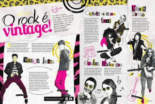
Here is the development and research for my double page spread. I will document all the decisions and changes that I make.
Reflection:
Again, this was honestly such a struggle to make. The problems I had with making this double page spread was deciding whether it would be better to follow the column guider or just freestyle it because some of the images were getting in the way. I had to make the text look neater and not too cluttered because the images themselves were already distracting enough. I also had to make sure I included a bunch of fun elements so that the article wouldn't be too tiring to read as my target demographic are mainly teenagers. I still had a bit of fun with this though as I had to think outside the box to solve all these problems!
Here are some of the double page spreads that I used as references in order to draft the sketches:
Some conventions I could note down after looking at the examples:
1. The image of the model is often showed as a large image that takes up a large part of the page.
2. The text will wrap around the image of the models.
3. The article is often separated into multiple sections with different topics.
4. The article is put into columns.
Which convention am I subverting?
I subverted the conventions by not adding a large image of my model, instead using polaroid frames to make it look more like a diary or scrapbook look which is commonly used by teenagers. Although I put some parts of my article into organized columns, I had to adjust some in order to make them wrap around the image so that the images would be visible.
Final product:


No comments:
Post a Comment