Labels

Wednesday, February 21, 2024

Final Magazine!

Here is the result and the final version of my magazine! I couldn’t find a free app that could display it like how a magazine actually would but this is the best alternative interactive site I could use!


Here is the link to a Drive folder just in case the images are not visible here:

Link

Tuesday, February 20, 2024

Critical Self Reflection

Attached here is my critical self reflection that I made on Canva.

Critical Self Reflection by Jasmine Santiawan

Here is the link to a Google Drive folder just in case the embedded presentation doesn’t work:

Link

Double Page Spread Development

Here is the development and research for my double page spread. I will document all the decisions and changes that I make.

Reflection:

Again, this was honestly such a struggle to make. The problems I had with making this double page spread was deciding whether it would be better to follow the column guider or just freestyle it because some of the images were getting in the way. I had to make the text look neater and not too cluttered because the images themselves were already distracting enough. I also had to make sure I included a bunch of fun elements so that the article wouldn't be too tiring to read as my target demographic are mainly teenagers. I still had a bit of fun with this though as I had to think outside the box to solve all these problems!

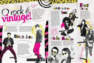
Here are some of the double page spreads that I used as references in order to draft the sketches:


Some conventions I could note down after looking at the examples:

1. The image of the model is often showed as a large image that takes up a large part of the page.

2. The text will wrap around the image of the models.

3. The article is often separated into multiple sections with different topics.

4. The article is put into columns.

Which convention am I subverting?

I subverted the conventions by not adding a large image of my model, instead using polaroid frames to make it look more like a diary or scrapbook look which is commonly used by teenagers. Although I put some parts of my article into organized columns, I had to adjust some in order to make them wrap around the image so that the images would be visible.

Here are some quick sketches of the layouts I made based on all of the references that I got on Pinterest:


Here is process in producing my double page spread:


Final product:


Contents Development

This blog post will cover the process of development for the contents page of my magazine. I will include my research and an overall walkthrough of the production.

Reflection:
Making this contents page was incredibly challenging because I had to simultaneously fill in the gaps of information that I didn't think to research about before. In addition to that, I had to somehow make it look like it related to my front cover page. However, the part I had the most difficulty in doing was formatting the upper part of the cover page since it was looking a bit too cluttered and funky. I needed to also find a way to fill in the white space in my cover page without making it look to messy as well. Overall, it was just a pretty bad experience for me unfortunately. 

Here are some references I kept close while designing this cover page:


Some conventions I could note down after looking at the examples:

1. The text is organized with columns (usually 3-4).

2. There is a large picture of the model taken with a long shot.

3. Page numbers are displayed beside or on top of the article titles.

4. The images of the models are displayed with solid backgrounds in rectangular frames.

Which convention am I subverting?

I decided to display my model with a transparent background to make her seem like she's a part of the page instead of just a picture pasted on. I still used columns and made my model take up a little more than two.

From these references, I produced multiple draft sketches just to get some inspiration going around!:


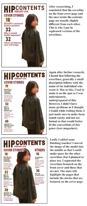
Here is the walkthrough of my thought and work process while making the cover page.


It turns out I made a mistake and accidentally forgot to include my fourth coverline "Everyone's latest crush" into the content page so I made sure to change one of the coverlines into that instead. I also made the "cover stories" text smaller so it wouldn't overlap the image of the model and will look neater. Here is the final product!


Monday, February 19, 2024

Front Cover Development

In this post, I will be updating my process for developing the front cover page of my magazine.

Reflection:
With this front cover page I really just learned that if an idea is not looking good as I put it together it’s just better to restart instead of trusting the process sometimes. I think I spent a bit too much time on this singular page because I was trying to decide the overall theme. It was honestly a trial and error method for this one and I’m glad everything worked out in the end. Again, I did waste a lot of time due to the changing of programs though so I’ve learned my lesson! I think that if I do this project again in the future I’ll have more specific references for what I want earlier on!


Here are some thumbnail sketches I made to have the rough idea of the layout and pose I'm going to use for my magazine cover page.


Here are two pictures I took of my peer. I directed her to pose similarly to two of my magazine thumbnails. I'll develop these images digitally and make a rough draft of the layout they would have.


Here are some of the fonts I thought would look good for the masthead. I mostly kept Y2K in mind because I was trying to go for a similar vibe and recently there has been a recent trend in people using the Y2K style again.


The drafts for my front cover end here. I took the photoshoot and I took a look at the pictures and realized that this theme that I was trying to use was not going to work out as the nature of my pictures seemed to be more "mature" to use this type of typeface for the masthead and style. Therefore, I am going to completely scrap the layout I have made so far and just start improvising based on the images I'll use for the front cover page. Here is what I've written down for my process!

References I kept in mind while designing this new front cover:


Some conventions I could note down after looking at the examples:

1. These magazines often use bright colored mastheads to attract attention quickly.

2. They also usually feature numbers in big text size.

3. The model are teenagers or young and famous.

4. The coverlines often discuss about love advice.

Which convention am I subverting?

I did not discuss about love advice in one of my coverlines because I'm planning to add that into the general article page on my contents section instead. For the coverlines, I mainly wanted to focus on mental health issues and solutions instead since it is one of my magazine's unique selling points.

Here is a step by step walkthrough of the production process:


After that, I added a price for my magazine. The price, $18, was what I settled with after researching and looking at the average price of teen magazines. On average, the price would range from around $20-$33 which is actually quite expensive. Since my aim is to target middle income teenagers who most likely don’t have too much disposable income, I decided that in order to make my magazine more appealing for purchase, I’d like to make my magazine a bit more cheaper than the others in the same genre which will also help it to become more competitive in comparison.


Heres my final product: