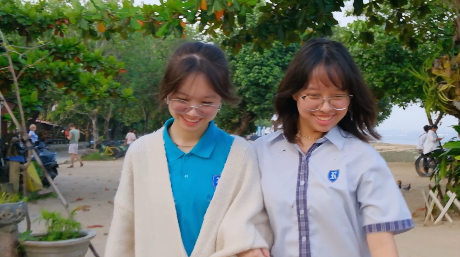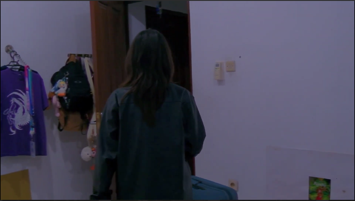
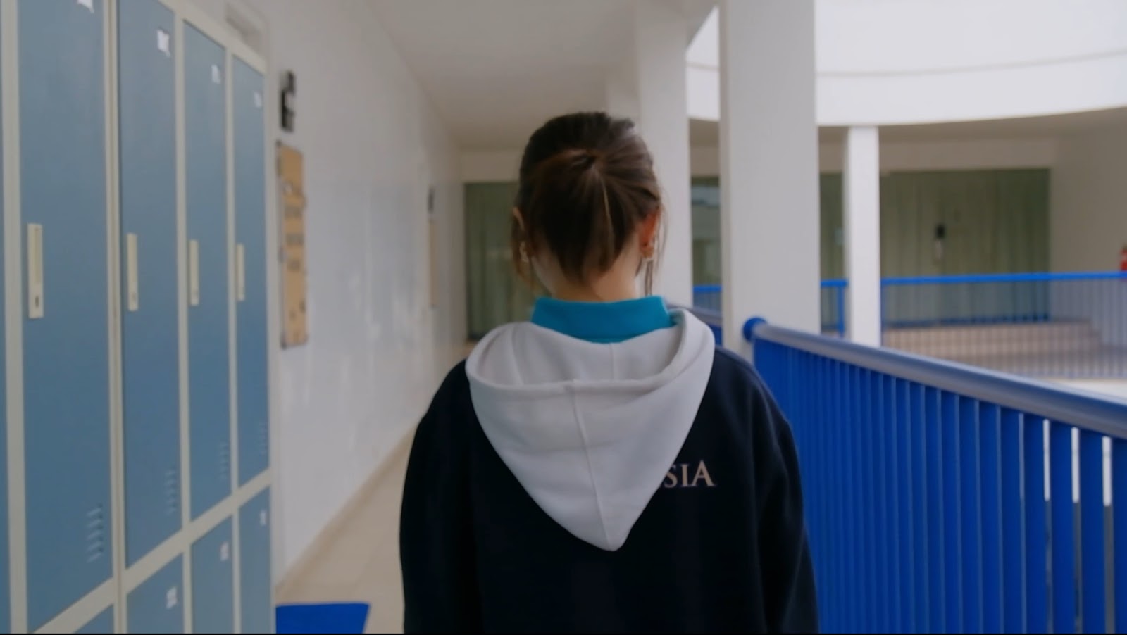
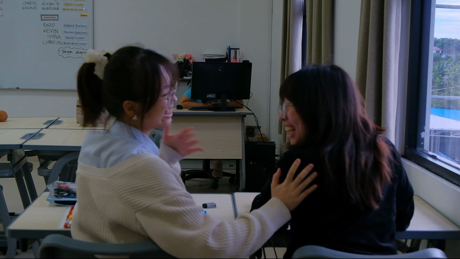
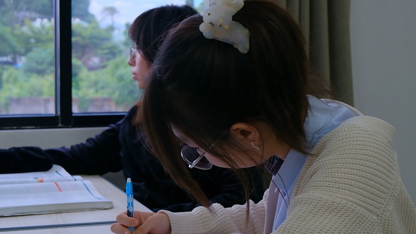
This scene used a match cut edit. Since we were initially confused about what scene we could add in this previously empty clip, our media teacher first suggested that we could be able to use a match cut. The decision to make the transition from an outside interaction to an in-school interaction between Jasmine and Viola was made. This was intentionally done as it connotes a key theme in our video, friendship. By including this scene, audiences are able to decode that Jasmine and Viola hang out with each other all the time whether it be outside or during school, having fun with each other in any setting. This also connotes that Jasmine and Viola know each other in a more intimate manner, being part of each other’s private lives, showing that they are more than just classmates. This scene helps to establish why there were many emotional implications with their separation through graduation further into the music video.
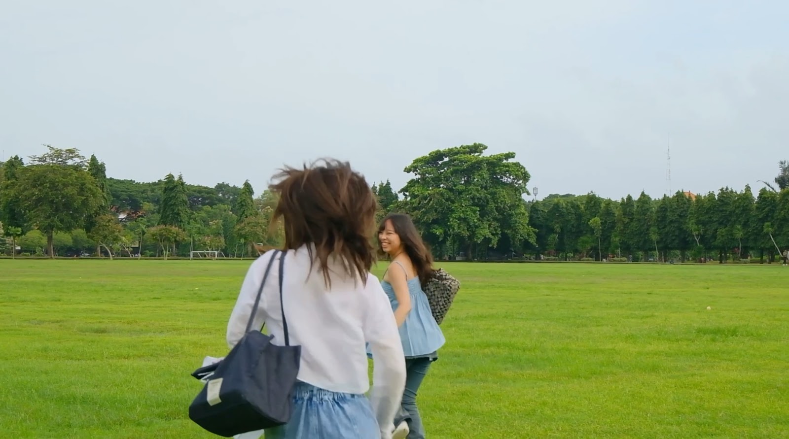
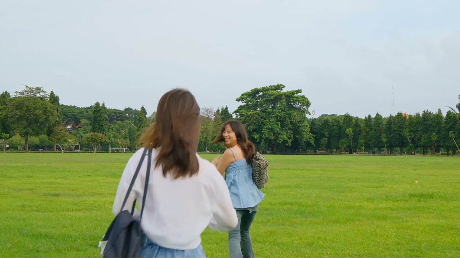
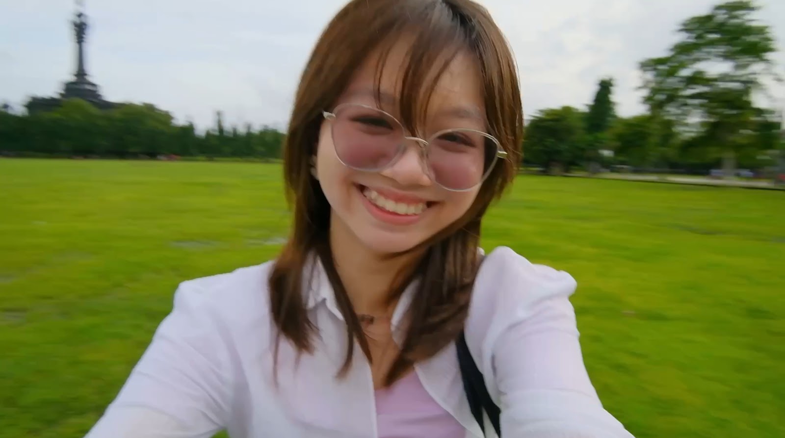
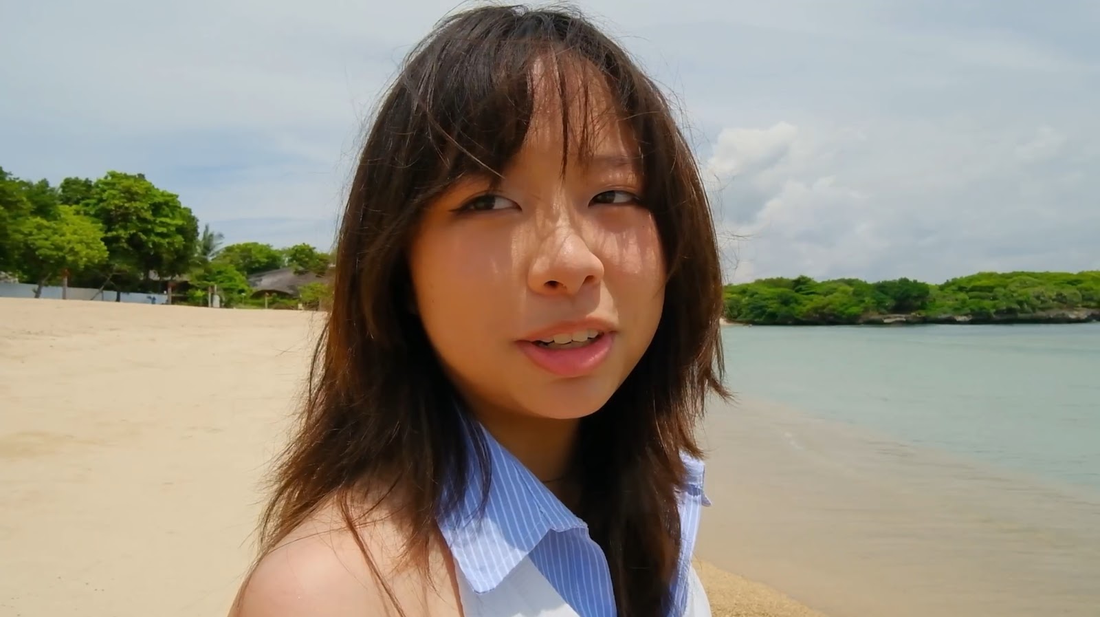
This scene uses a long-shot angle, which is often used to show the subject’s interaction with the setting or environment. In this case, I decided to use a long shot in order to show the bright and vibrant field which would connote happiness experienced by the subjects and set the overall mood/vibes. In addition, this shot shows that the area that Jasmine and Viola is in is very isolated from others. This highlights the fact that they are seemingly the focus in each other’s lives.
The spinning around (while holding hands) in the next scene, is a cultural code according to Barthes’ narrative codes which symbolizes friendship and love in media (mostly western) as it is an activity that people only do with those they are fond of. It is also done mostly by younger people, connoting a sense of liveliness and immaturity, which shows the contrast between before and after graduating and growing up shown throughout the music video (Binary opposite theory by Levi Strauss).
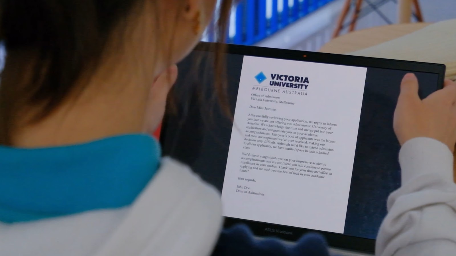
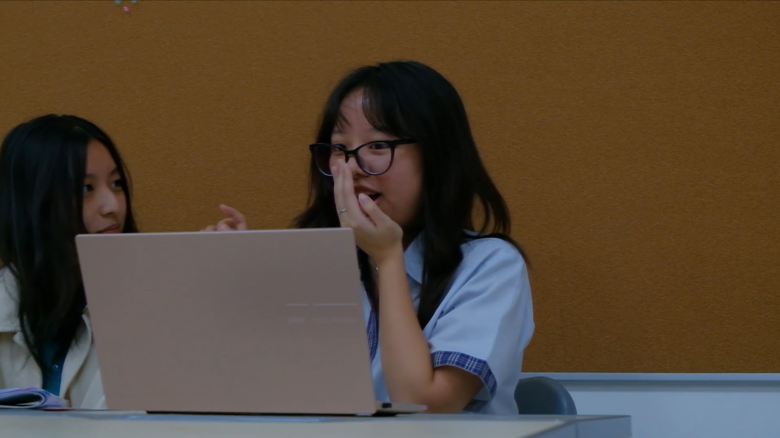
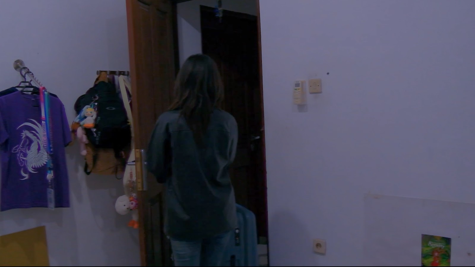
This scene used an over-the-shoulder camera angle to show the content viewed by the subject, Jasmine. Although the scene is quick and the audience doesn’t have a lot of time to view the text, the reaction shot (edit), cutting from Jasmine reading and closing the laptop, to walking sternly shows that she was rejected. Reaction shots are used so that the audience are guided to how they should feel based on the subject’s expressions.
Similarly, the next scene also shows a reaction shot. Viola attempts to hide the content she is reading when it cuts to Jasmine’s reaction, with an expression filled with betrayal. This edit helps to show the audience the emotions that should be felt during this scene and helps to make the narrative more clear, setting the stage for the conflict/issue later on in the music video.
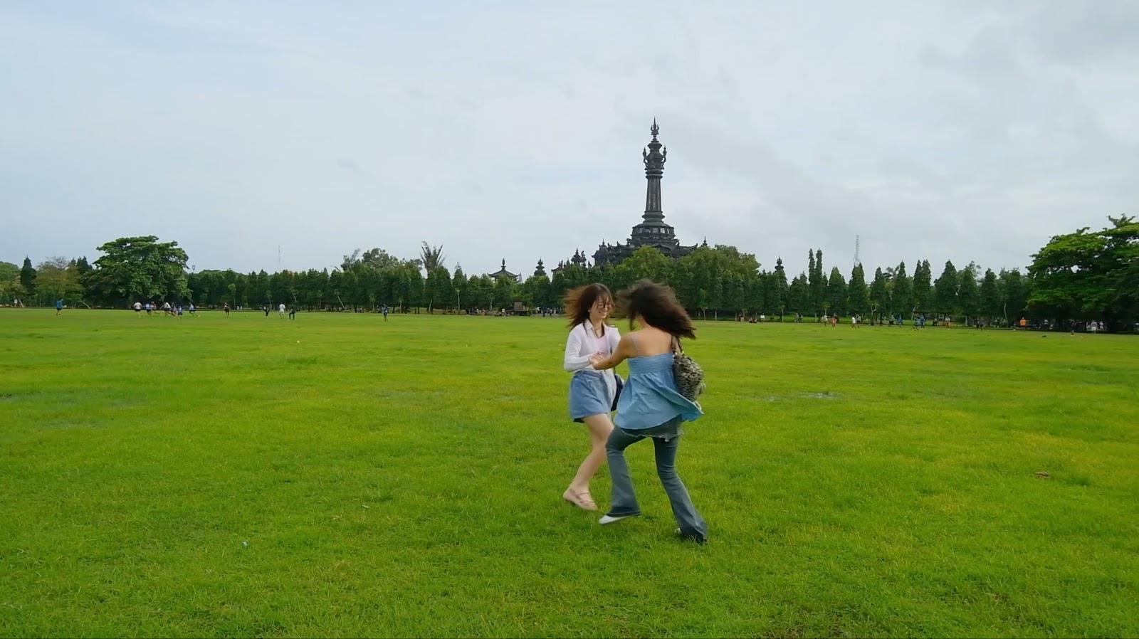
This scene utilises an action match cut edit of Jasmine and Viola spinning around. Action match cuts, such as in this scene, have two clips where the subject has the same or similar movement. My intention in having this scene was so that this scene could show that both subjects were intertwined with each other, connoting further the deep connection between the two. The same movement immediately allows the audience to make the connection that both subjects are doing the same activity. In addition, the close-up shots showing the two laughing and having fun emphasise the love that they have for each other as friends. All of these elements combined convey to the audience that both characters have these mutual, intimate feelings for each other. As for colour, this scene is drastically more saturated and bright compared to the cool and darker tone from the previous scene, where both subjects are at the beginning of their conflict, heavily contrasting the intended emotion and vibes for the two scenes.
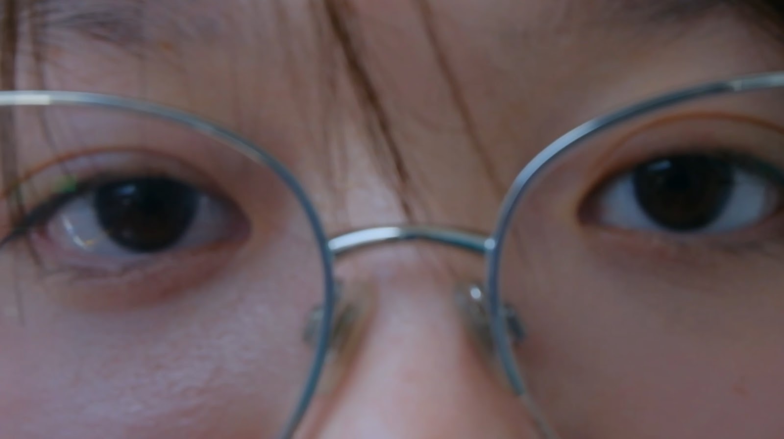
This scene with the extreme close-up shot of Jasmine’s eyes and a cut to a close-up shot of Viola’s face further establishes that Jasmine is constantly looking towards Viola in the music video. Therefore, even if Jasmine or Viola looks at the camera directly, the audience will understand that it is not a direct mode of address towards the audience, instead showing that the shots are filmed from Jasmine’s or Viola’s perspectives which gives further insight into how both subjects view each other in the music video. This same concept applies to most of the scenes in the music video.
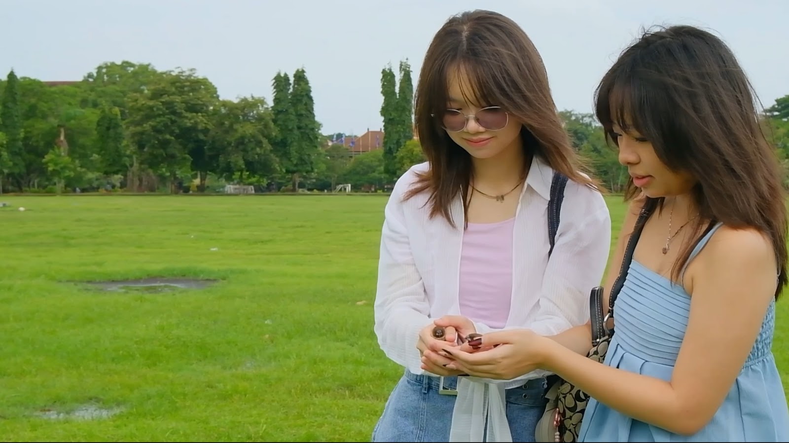
This low angle shot is used during the conflict scene between Viola and Jasmine. The usual connotations of this camera angle shows the superiority of a subject, although the low angle of this shot is not very obvious as we didn’t intend to make Jasmine look too daunting. This angle for this scene was intended to connote that Jasmine feels a sense of superiority as she feels that she can change Viola’s mind, making Viola stay with her instead of going to a different university. This gives insight to the audience of how Jasmine feels about this situation.
Typical conventions of using a low and high angle shot is that they are both often used together to show where two different subjects stand and how they feel about one another. Using a high-angle shot to capture Viola in this scene shows that Jasmine is looking down on her, feeling a sense of disappointment with Viola’s decision. Viola turns back to look at Jasmine with an annoyed glare, making this scene seem even more hostile between the two subjects. From Viola’s point of view, this angle could show that she is fed up with Jasmine and has given up trying to reason with her.
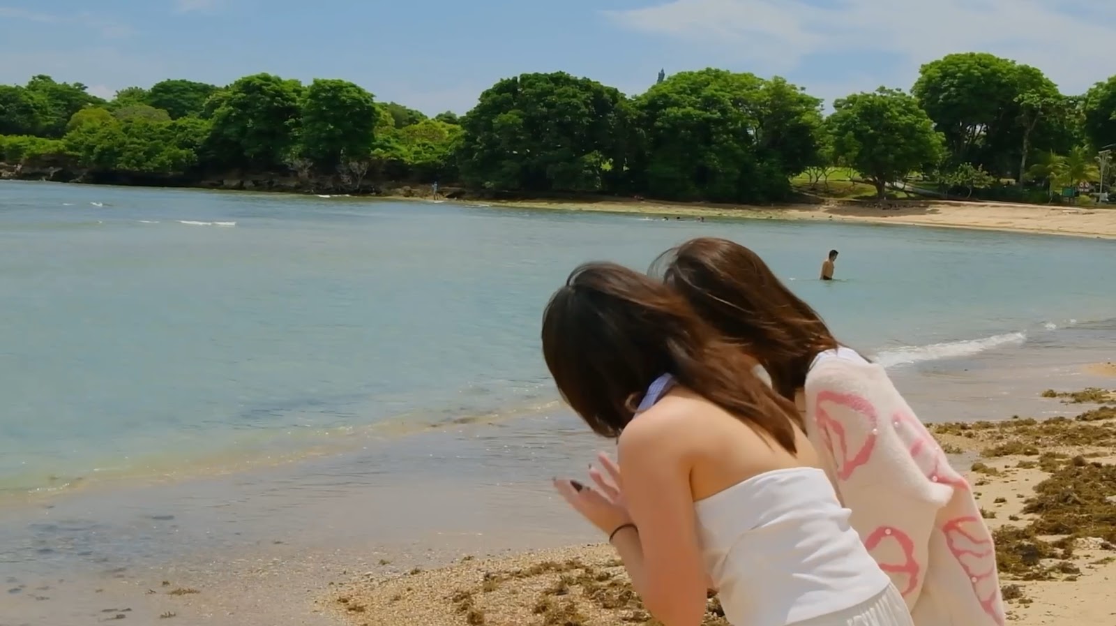
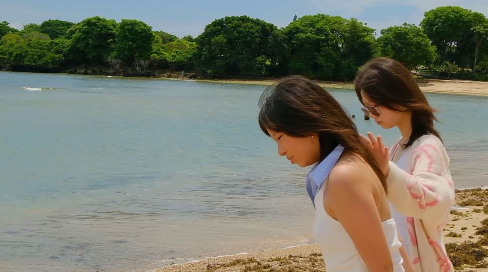
For this scene, I decided to record the sounds of waves crashing after filming the scenes for this clip. After that, I thought that it would be a good idea to isolate the audio and overlay it with the song. The audio of the waves occurs in the part of the song where it is quiet, so that it is audible to the audience, yet not too loud and dominating. The intention behind this was so that it could be more immersive for the audience, establishing the setting of the clip (which was at the beach) more quickly, as sudden scene changes could often be confusing to the audience.
In addition, the colouring for this scene is bright, saturated and almost dream-like. This contrasts with the previous scene of the conflict, which was dark and dull. This will allow the audience to understand that this scene is an analepsis instead of being the next sequence of events. In addition, it shows Jasmine’s mindset and the difficulty/ weight of the separation of Jasmine and Viola, considering all the happy times they’ve been through together. It is a similar concept to the spinning scene with Viola and Jasmine.
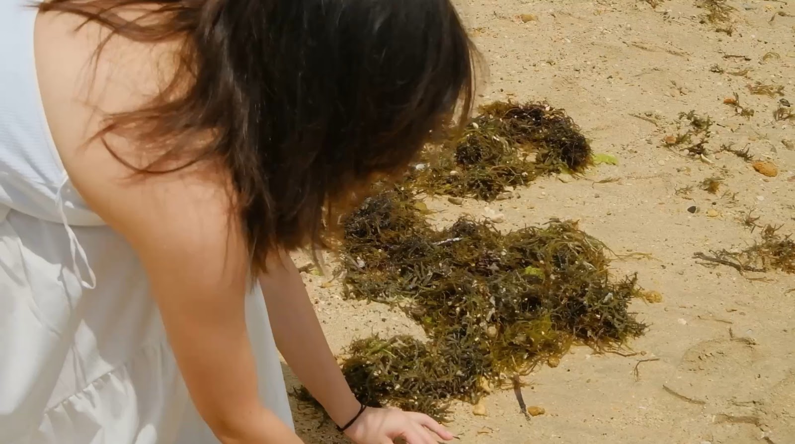
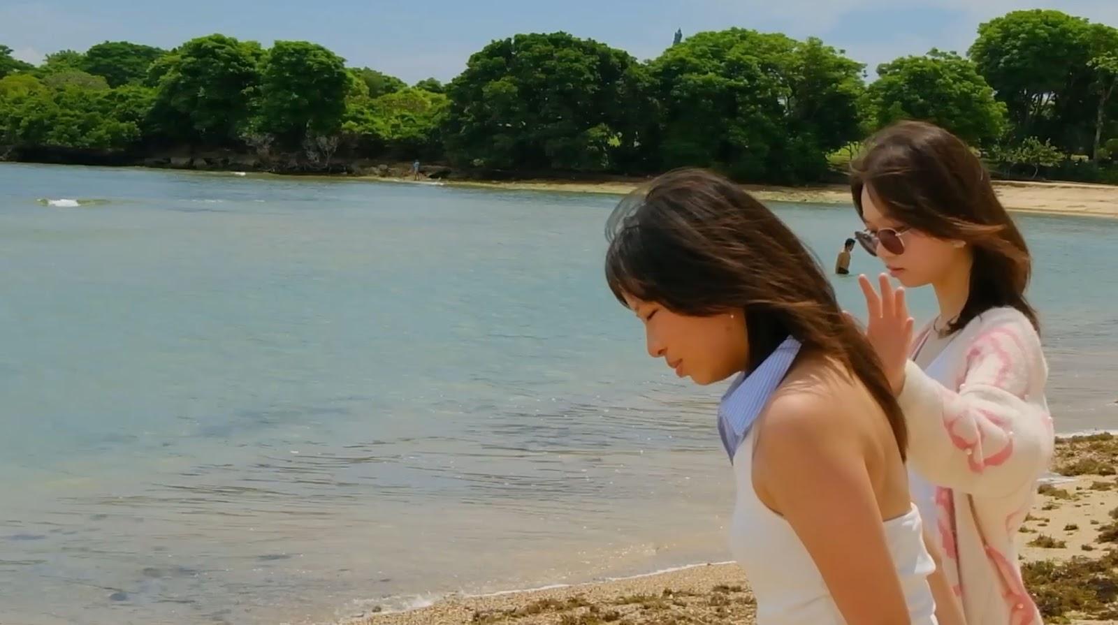
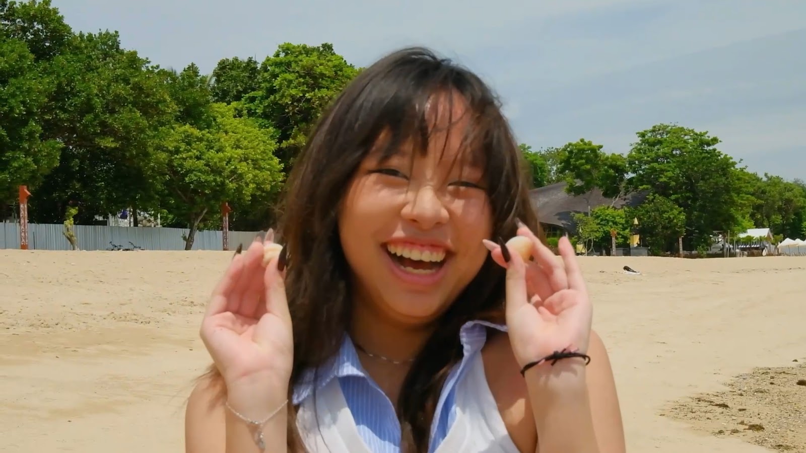
This jump cut or action match cut was intended to make Viola’s action (picking up the shells) more clear as the camera angle is closer towards Viola in the second clip. This will be important for the next scene. In addition, this edit will make it more interesting for the audience, making them pay attention to this important scene as it feels more lively and dynamic instead of the usual static shots used throughout the music video.
This clip is from the beach hangout scene.
This scene is from the fight/ conflict scene.
This scene is from the ending acceptance scene.
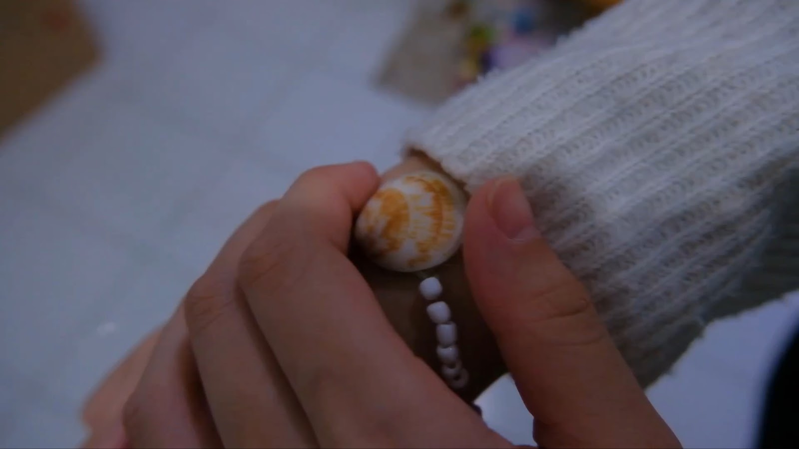
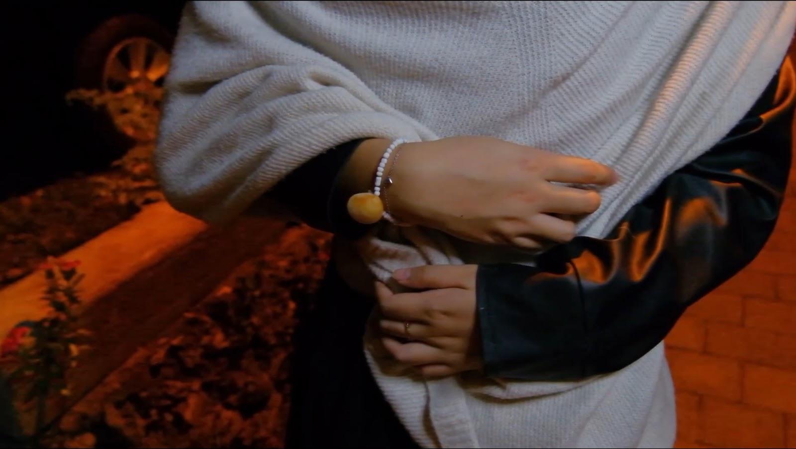
As mentioned before, the scene with the shells becomes important throughout the second half of the music video. The shell becomes a symbolic code (Barthes’ Narrative codes) of Jasmine and Viola’s friendship. At the beach scene, the shells are found together by Jasmine and Viola, representing how their friendship was formed based on a mutual decision filled with love and trust. Later on, the audience will see the shells again, this time being turned into a friendship bracelet, which is a convention of those who are best friends as they often have matching accessories to show a connection between one another. However, in this scene Jasmine throws the bracelet to the floor, representing her decision to break off their friendship after feeling betrayed by Viola’s decision. Lastly, in the ending scene, a shot with a long duration shows that Viola decided to keep her half of the friendship bracelet. This symbolizes Viola’s love for Jasmine as even after the fights they had, Viola wanted to keep something to remind her of Jasmine and their friendship, even though Jasmine made the decision to throw hers away. The audience isn’t explicitly told what will happen after the end of the music video, however this scene shows the audience that their friendship can be mended even if they go separate ways. This applies Barthes’ hermeneutic code where the rest of the plot is left open to the audience’s interpretation, however the preferred reading (Stuart Hall Reception Theory) would be that Viola and Jasmine made up.
This scene also used a match-cut edit. The main intention behind doing so was to bring back the audience to the current part of the music video’s narrative. Before this scene, a very joyful scene occurred, showing the stark contrast between how Jasmine and Viola’s friendship was formed with so much happiness, to how it was ruined right after. Again, using this editing technique helps to show the audience that although Viola is the same person in both scenes, circumstances can quickly change, resulting in such issues. In addition, the blue colorgrading on the second scene also helps to accentuate the contrast as both scenes are intended to be opposites in colors, one being warm and the other, cool.
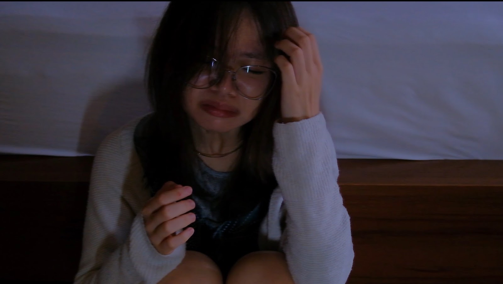
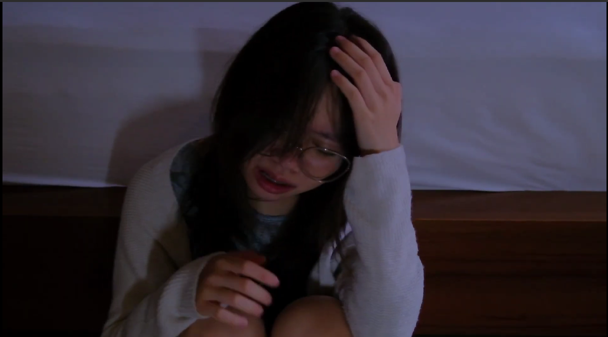
This scene uses a high-angle shot, showing a shift in the dynamic of power between Jasmine and Viola. In this scene, Jasmine has finally accepted that there is no more negotiating with Viola and that there is no way to stop her from leaving, putting her in an inferior position. This contrasts with the previous fight scene, showing Jasmine with a low-angle shot. To further connote this, the mise-en-scene with Jasmine’s acting, showing her despair by crying, and the blue color grading (which connotes sadness) is used.
As mentioned before, the shift in the dynamic of power is visible in this scene as Viola is portrayed with a lower or medium shot, after she has finally made her decision to leave overseas for university, despite having to leave Jasmine behind. This scene shows her superiority in the situation.
There is a flashback montage from the timestamp 2.30 - 3.08.
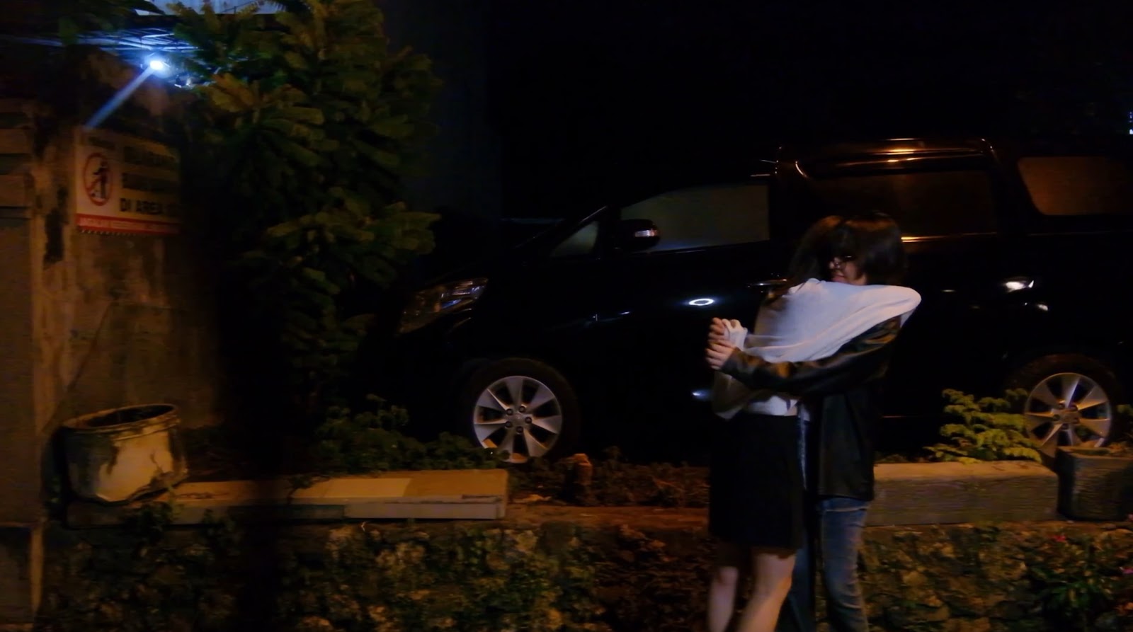
This montage edit was added after Jasmine decides to chase after Viola before she leaves for university. The intention behind adding this scene was to show the audience why Jasmine is so desperate to keep Viola, despite everything that has happened between their friendship. This scene symbolises all the happy moments they have spent together, making it something that is hard to give up so easily. In a sense, Jasmine feels as though she is obligated to apologise to Viola before their friendship is ruined forever, and these memories (in the montage) will be the last good thing she has to remember about their relationship. This montage edit helps to connote the passage of time, making it easier to establish that a lot of time has gone by throughout their friendship, showing the audience that Jasmine and Viola have more than just a casual friendship.
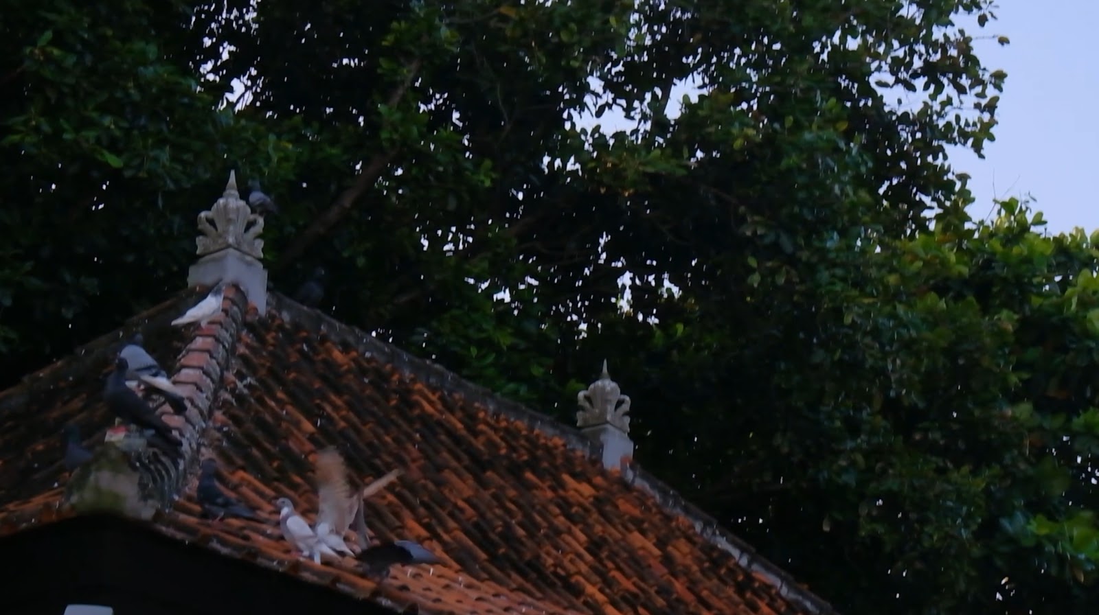
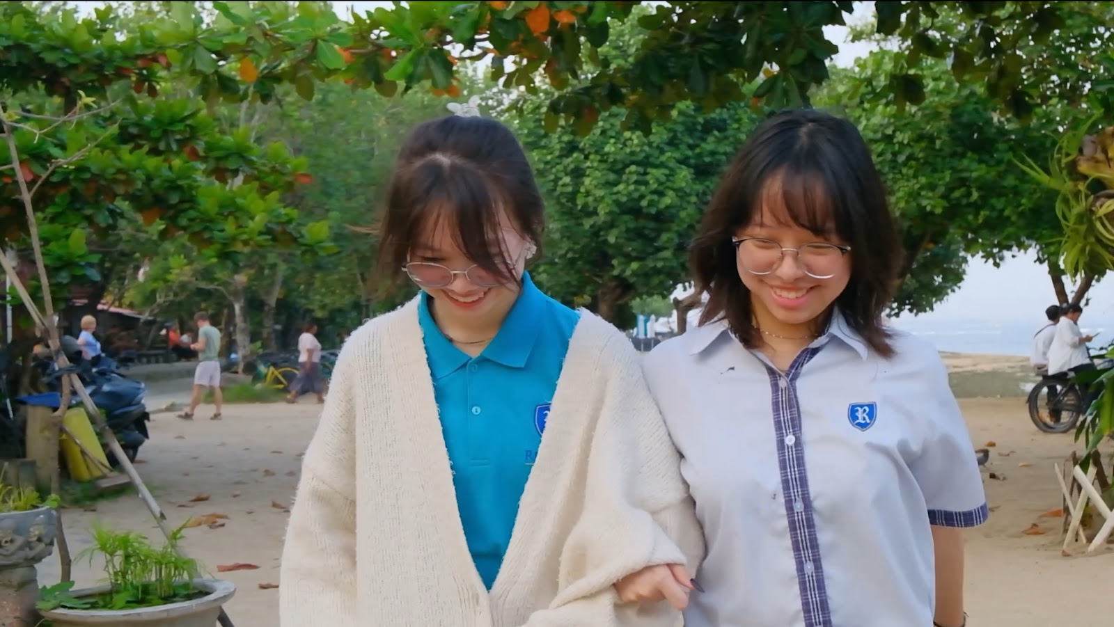
The ending scene with the birds flying is a call-back from the first clip of the music video, which showed a similar scene to this one. There were a few different intentions behind adding this scene. One reason was that this scene was in the first part of the music video, where Jasmine and Viola were still carefree and spending time together on the beach, hanging out. Adding this scene could encode and suggest the message that at the ending scene, Jasmine and Viola’s friendship has been restored to how it was from the start. If the audience pays attention to the music video, they will be able to receive this preferred reading (Stuart Hall’s theory of encoding and decoding). Other than that, the birds flying in this scene could connote freedom, which connotes that Jasmine and Viola have finally accepted to let each other walk their own paths while remaining as friends.
Outfits:
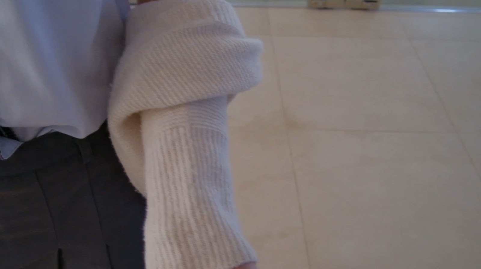
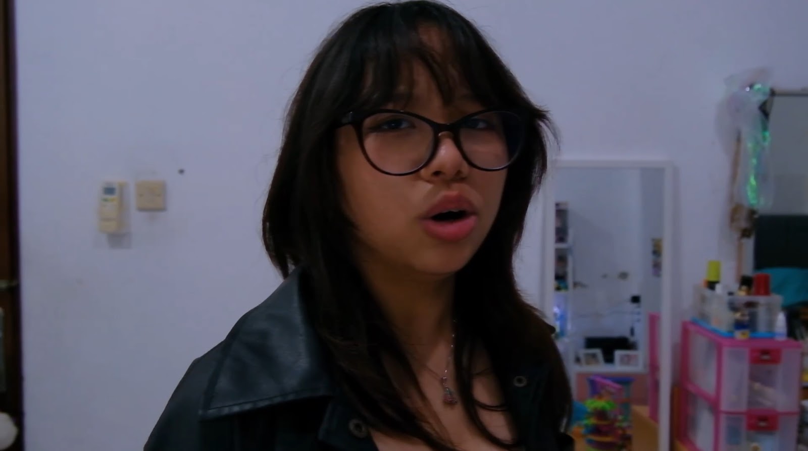
In all of the scenes in the music video, Jasmine is always wearing an outer, whether it be a sweater, jacket, etc. Initially, this was intended to connote softness, which was what we wanted our star’s persona to be. However, as we developed the music video, the outerwear started to represent a different aspect of Jasmine’s character. Outerwear like sweaters are comfortable, they keep the people wearing them warm and shielded from harsh environments and weather, as well as conceal parts that people don’t want others to see. In this music video, Jasmine is seemingly a very positive friend and person; however, throughout the video, it slowly uncovers her true nature, that is, her being scared of change and not being in control. The outerwear represents how Jasmine hides who she is, until the end when she finally accepts that although her dreams of going together to Victoria University with Viola were shattered and she can’t stop Viola from leaving, she can still keep being friends with Viola, although they must go their separate ways.
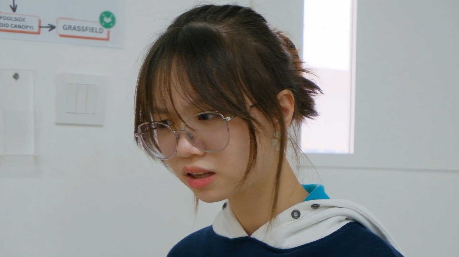
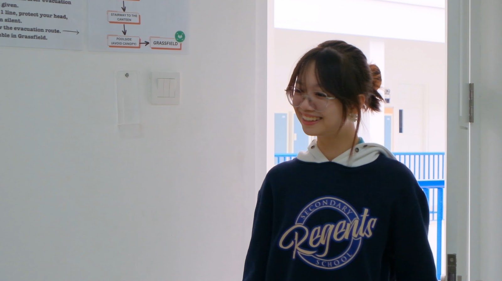
Although in some scenes, Jasmine is wearing a school uniform, she personalises it by wearing the outer, which could also connote to her being a free-spirited or creative person, as they often are not held back by limitations such as uniforms.
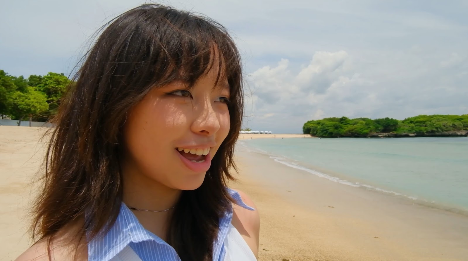
Additionally, Jasmine’s outfits are almost all light colored, with the exception of during sad or fight scenes, such as the confrontation and ending scenes, where she is wearing a darker colored outfit (second and fourth image). The intention behind this was quite simple and straightforward. The light colored outfits were chosen to connote Jasmine’s happiness, joy and positivity, which were supposed to be radiant. Bright colours often represent positive emotions. However, during times of conflict or sad scenes, Jasmine wears a dark colored outfit, which connotes unexpectedness, sadness or reservation. Dark colours often represent mystery and negative emotions.
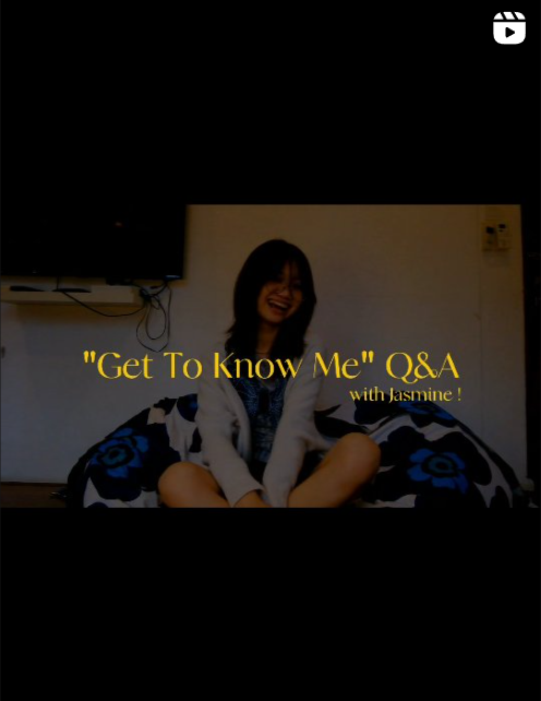
Social Media:
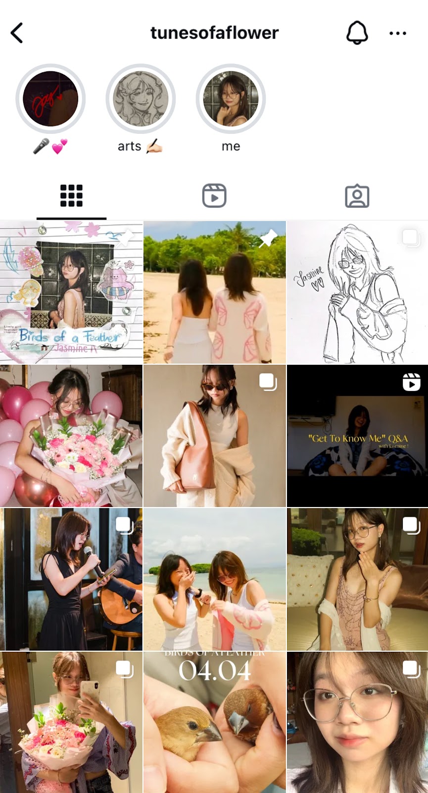
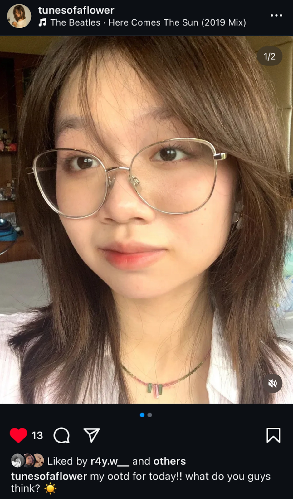
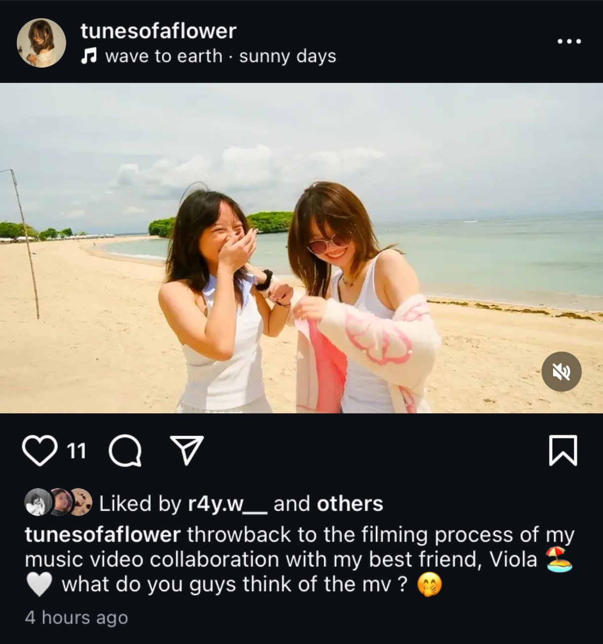
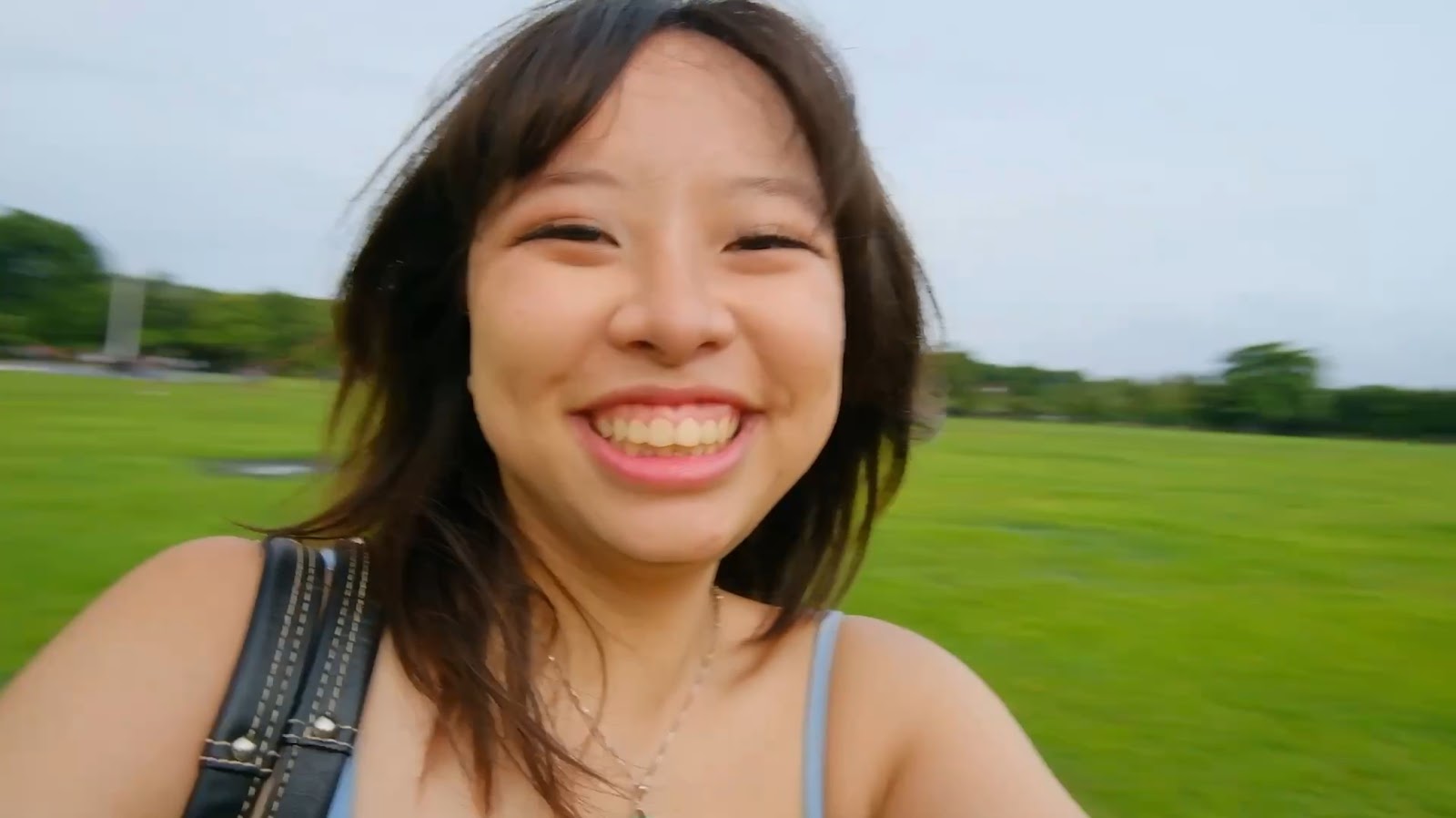
The combination of bright colours and warm lighting for most of the shots makes the artist’s social media page look approachable to the audience and fans. These warm colours often connote comfort and safety, which is something we wanted to achieve to attract the audience. This is also especially important since one of our stars’ personality traits would be relatable and down to earth, which is usually an adjective used to describe somebody who is “human” in how they express themselves. Being human means showing some vulnerability and flaws; we showed this by using the personal pictures, which aren’t heavily edited and were taken by the star on her own. We wanted the audience to perceive this positive image as Jasmine’s REAL personality instead of a constructed REEL personality that is used to construct a positive reputation for the star (Dyer’s theory of Stardom).
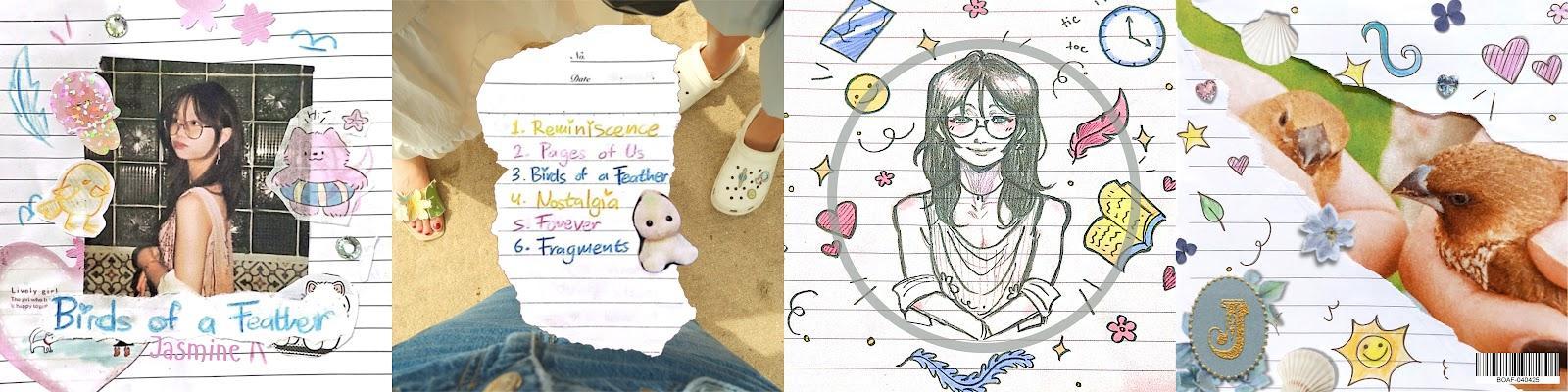
Digipak:
Front cover:
Camera:
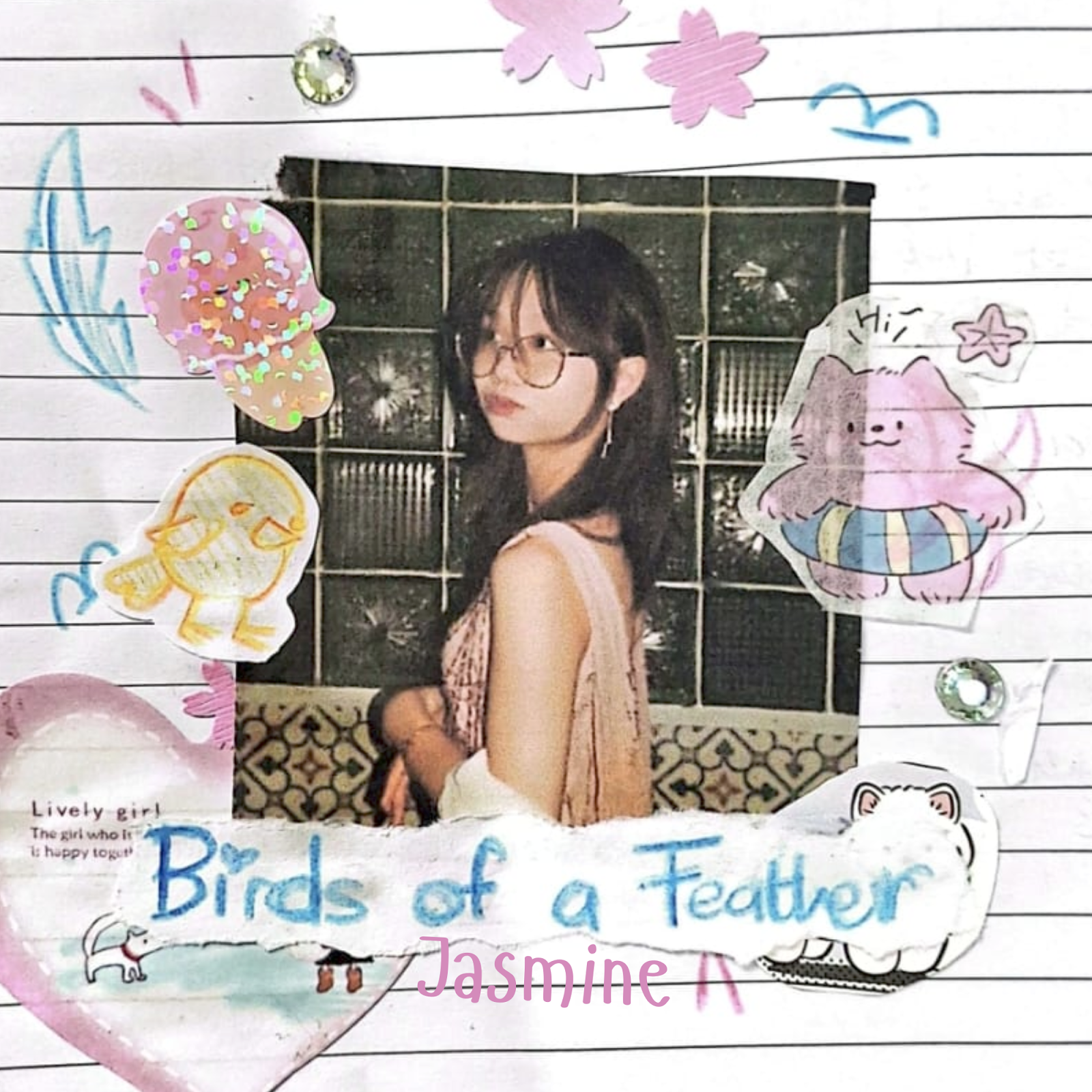
The photograph of the star, Jasmine, was taken with a medium-shot angle, which we wanted to use to show the star’s outfit while being close enough to see her facial expression clearly. The star’s facial expression is playful, with puckered lips, often used to connote cheekiness, playfulness and an innocence that comes with youth. In addition, this unserious expression and pose could represent Jasmine as someone who has a free-spirited, creative and fun REAL and REEL personality, which is the dominant reading we wanted to construct for her.
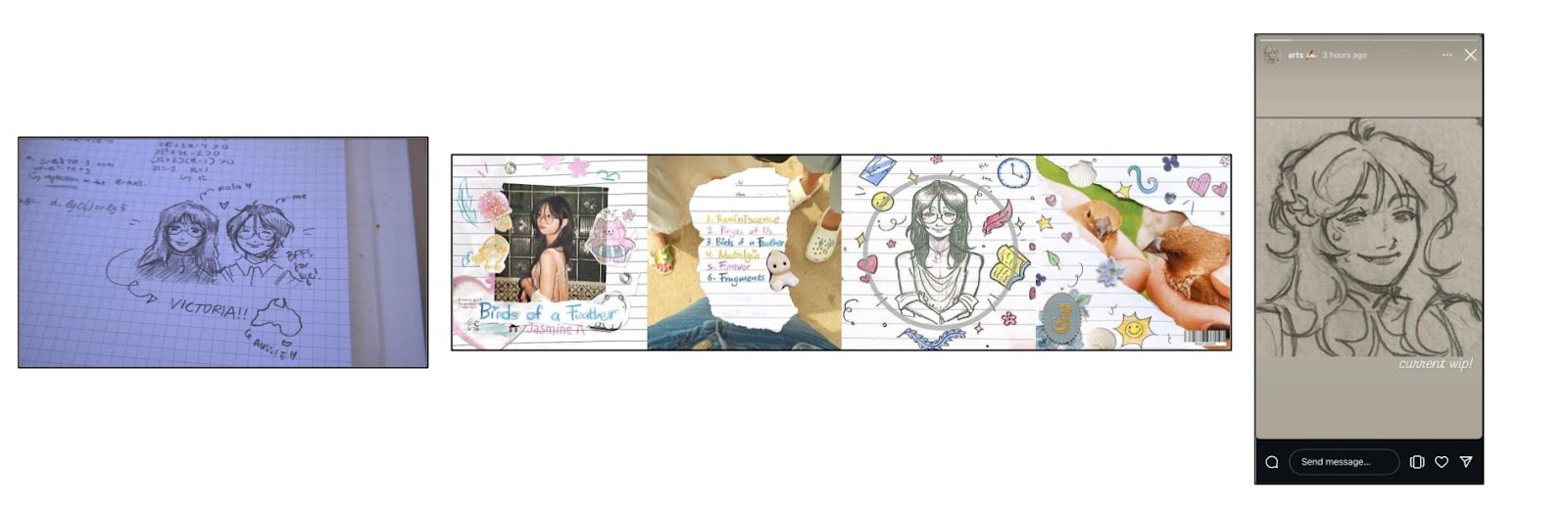
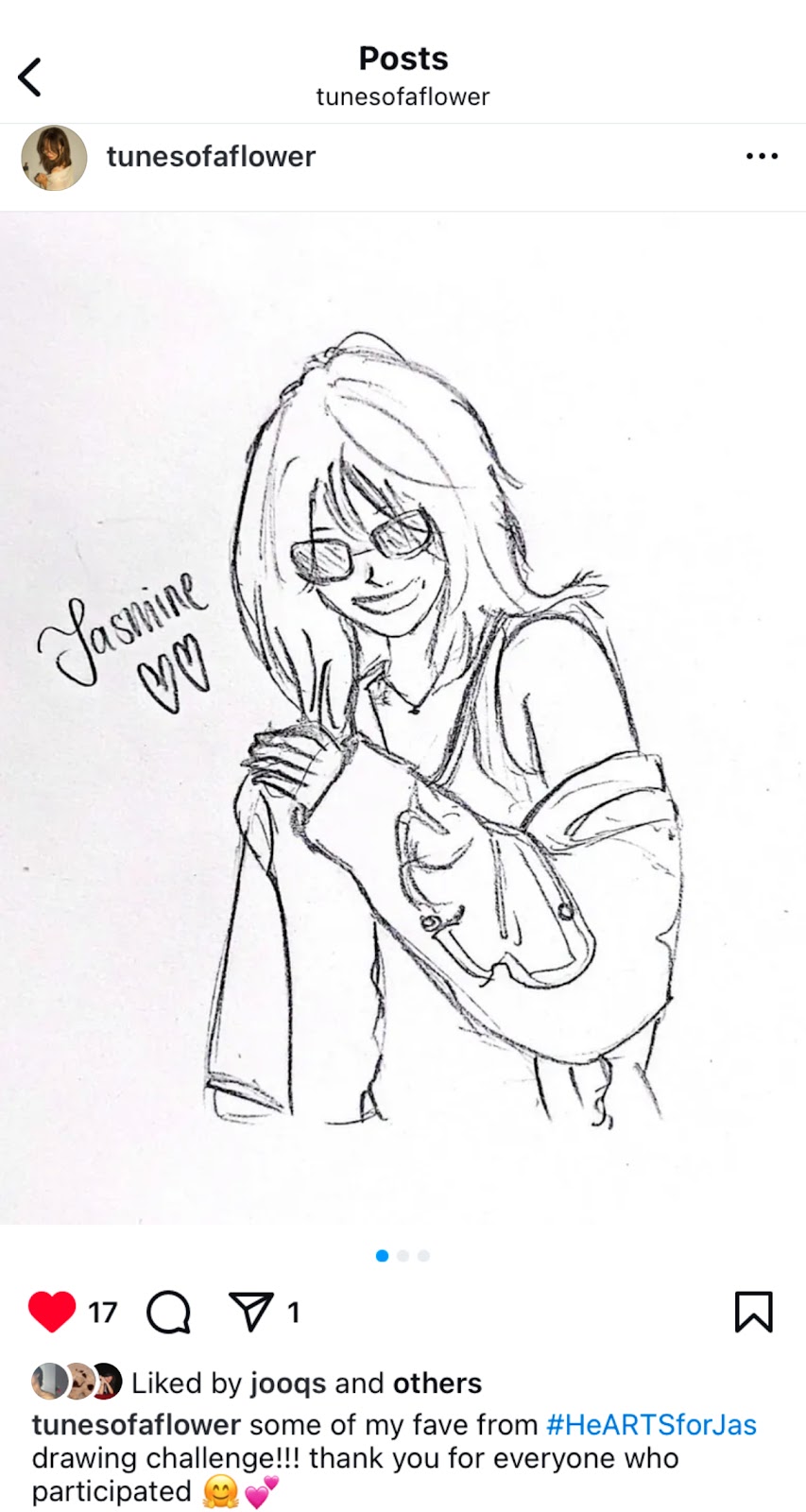
The whole album cover was taken in a close-up shot, cutting off some of the elements on the page, like the stickers. This was done so that the front cover would seem like part of a schoolgirl’s notebook, filled with doodles and decorations rather than just being slapped onto a blank notebook page. This is further explained in THIS blog post.
Mise-en-scene:
The page looks quite cluttered and messy, being filled with decorations such as stickers and doodles. This was all manually stuck by hand, and the image was printed out. This was intended to show the artist’s creativity with hand-drawn art and show her personality. This digipak seems quite personal as it was made with the star’s interest in mind. The handwritten text for the album’s name shows the audience that the album was made full of love and passion for each song.
The colours of the decorations, drawings and text are mostly bright and colourful colours, like blues and pinks. This further expresses the star’s personality as her favourite colours may be those, thus allowing her audience to connect with her further. These bright colours also connote positive emotions and vibes, which are attractive to the audience.
Editing:
The only thing digitally added to the front cover was the name of the star, Jasmine, at the bottom middle of the page. Initially, we had used a cursive and neat font instead, which I had changed because I felt as if that was too “proper”. Although the font we decided to use was simple, Hangyaboly on Canva, it resembled handwriting the most and was a cute addition to the front cover, which was already filled with cute elements such as the stickers and doodles.
Inside the digipak (Only the right side, as I have already explained the left side of the digipak in my Critical Self Reflection):
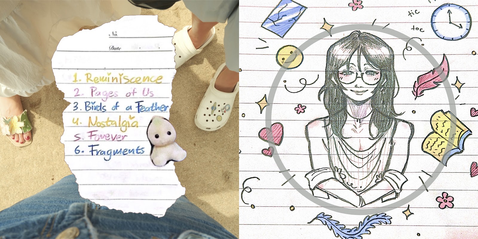
The image was taken using a close-up shot, cutting off some of the doodles near the corners. As mentioned before, this will create an effect that will make the picture seem like it belongs as a part of a notebook page filled with these doodles. The self-portrait of the star shows the audience how she portrays herself, with a bright smile and expression, which connotes that she wants to be seen as a joyful figure. In addition, the doodles surrounding the portrait symbolise the songs on the tracklist, more about this can also be read about in THIS blog post. Lastly, the image was edited to have increased vibrance and saturation. This was to make the image more colourful and appealing to the audience, matching the overall vibe of the digipak. Aside from that, these bright colours connote a childlike personality, as it only uses a few colours (yellow, red and blue) which children often use when doodling.
Back cover:
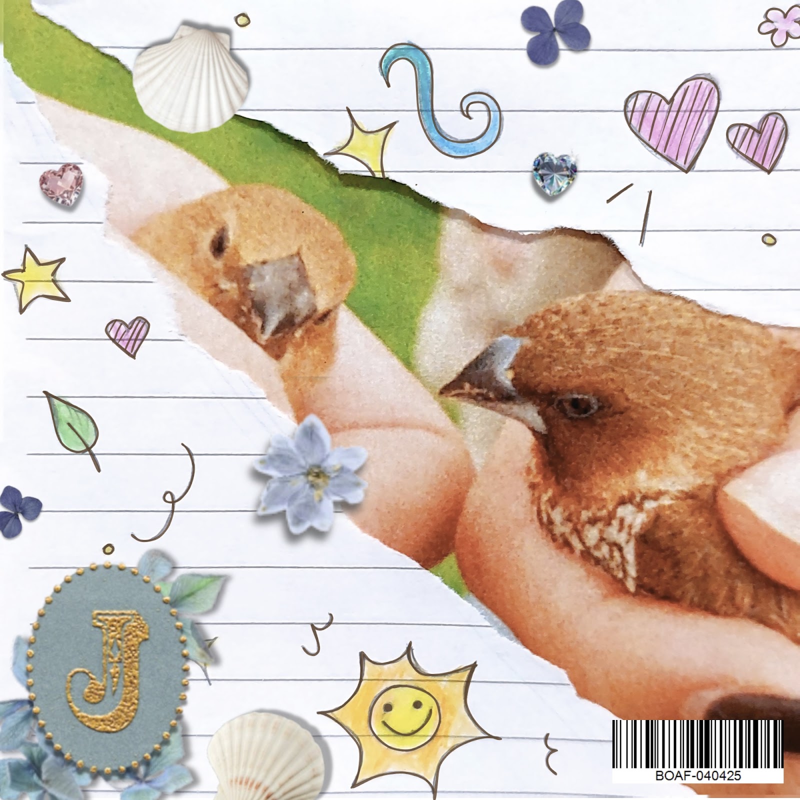
Again, similarly to the other parts of the digipak, this was taken using a close-up shot, the doodles are cut off, and the effect of this decision was already explained previously. The image of the birds in the background was edited to become more saturated and warmer, as well as adding a film grain effect. The intention of doing this was to make the image seem like a fuzzy, nice memory instead of just a picture, as the effects added usually connote that. The image of the birds symbolises friendship and intimacy, with the birds facing one another, the hands holding them touching each other, further connoting closeness.
Digipak Exclusive Signed Poster:
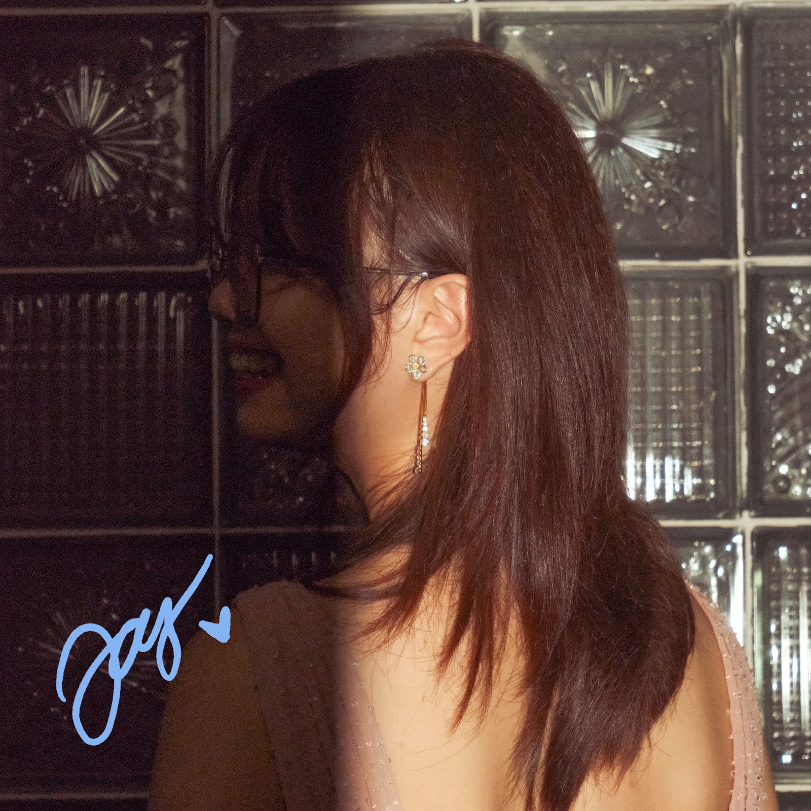
The other reason why I chose this image was that it was different from the overall feel of the digipak. Our digipak is very light and bright in colour, contrasting with this poster, which is filled with dark colours. The face of the subject is not well-lit, making her expressions a bit unclear. Pairing this with the half-lit composition would connote that the star is hiding something from the “light” or keeping it in the dark. This may make the audience interested in Jasmine’s REAL personality (Richard Dyer's theory of Stardom), which is something she may be teasing. In addition, the backless dress could connote a sense of openness she is conveying to her fans. Adding the signature of the star onto this may make the audience feel as if the star is addressing them in a more personal way, gratifying their need to be emotionally connected with the star.