This post outlines the process of development and research that we did in order to create our final thumbnail for the crime documentary opening.
Thumbnail Research and Development:
This was mainly written by Rachelle while I threw in some of my thoughts and opinions for a few parts of the research.
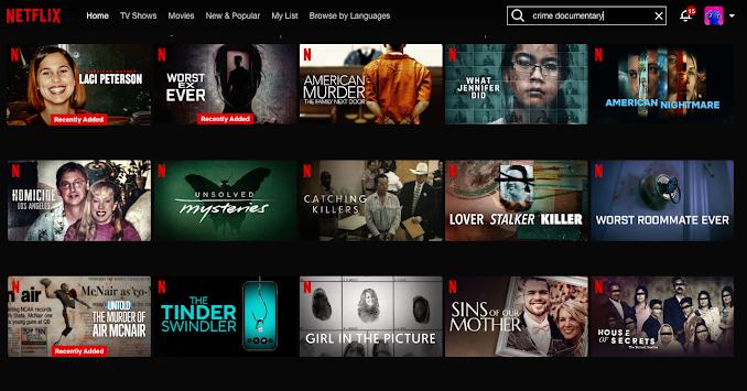
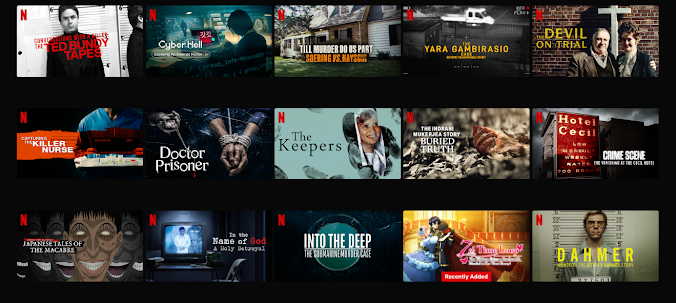
I had searched for crime documentaries on Netflix to look at their thumbnails as reference. A common convention that I noticed is the usage of medium to close-up shots of key figures such as the perpetrator or victim. These types of thumbnails made me question what those people did and their part in the story (e.g. "what crimes did they commit?", "what happened to them?", etc). I think that using thumbnails like this would help engage audiences more as it evokes an emotional connection. Another convention that I noticed is the use of dark color schemes. They typically use black, blue, and green color schemes. I noticed that these colors create an eerie and ominous atmosphere and create suspense as the audience feel that the documentary will reveal unsettling information, especially with the dark lighting used in most of them. Some documentaries use images of crime elements as thumbnails, such as the crime scene, weapon, etc. This feature gives the audience a hint of the crime, but doesn't reveal too much that they know exactly what the crime is. This follows the hermeneutic code cultivated by Barthes which refers to any element in a media product that isn’t fully explained, existing as an enigma for readers. This increases their engagement as it makes them question the context of the media product shown.
I made a few thumbnail sketches based on these conventions and showed them to my teammates to discuss which one we think would convey our message the most effectively. We want our audience to feel drawn to our thumbnail and feel uneasy about it, yet also curious about what our documentary is about.
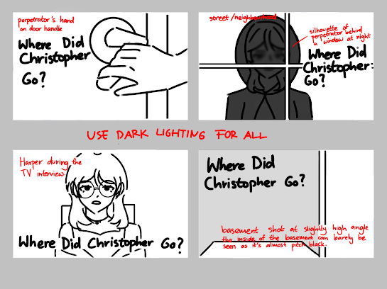
Hand holding door handle — Image of crime element
A hand holding a door handle as a thumbnail would connote an invasion of privacy, this would evoke anxiety within the audience. This would make them question what was behind the door, who's holding the door, etc. However, door handle images are very commonly used in crime documentaries (as seen on the 'Worst Roommate Ever' thumbnail on my research above), so our thumbnail wouldn't really stand out from the others.
Silhouette figure behind window at night — Shot of key-figure
Using a silhouette figure behind a window would create a very ominous and eerie atmosphere when audiences stumble across it. This thumbnail would definitely give the context of stalking to be connoted by the audience. The imagery of someone watching you from outside the window (the thumbnail is shot to look like the audience are actually looking out the window), is very disturbing, so this would very likely intrigue the viewers, specifically our target audience.
After some thinking, I decided not to use this since taking outdoor pictures at night would be very difficult to do as we (me and my teammates) don’t have the proper lighting equipment to shoot these types of pictures, and none of our houses has windows that are clear enough and/or the windows are on the 3rd floor of the house.
Picture of perpetrator during the interview — Shot of key-figure
This is a very commonly used thumbnail in crime documentaries (as seen on the research I did). Pictures of perpetrators as thumbnails, usually medium to close-up shots, catch the audience’s attention as it creates an immediate connection between the two, making the audience question the perpetrator’s personality and what crimes they did. However, showing the perpetrator upfront will bring down the mystery. Especially since we don’t want to completely reveal the perpetrator in our documentary, this thumbnail will not be suitable.
I discussed with my teammates and we came to a conclusion that this thumbnail would be too cliché as it is too often used in crime documentaries, we want our thumbnail to stand out.
Basement — Image of crime element
Basements are often associated with captivity, this fits our kidnapping theme very well. The picture of the basement will be shot from a higher angle, this creates suspense as it makes the audience feel more vulnerable, as if they’re looking at something sinister down the basement. This creates fear and anxiety within the audience, but also makes them curious as to what lies in that basement and what crimes have happened there.
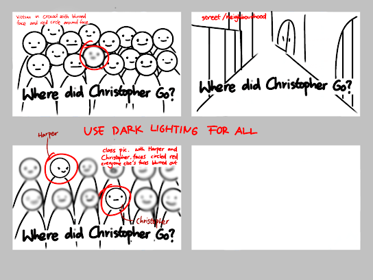
The street/neighborhood — Image of crime element
Showing the street/neighborhood as the thumbnail creates a sense of familiarity and relatability, highlighting the fact that these crimes can happen anywhere, even in familiar spaces. However, I feel like a picture of only the street/neighborhood would be bland as it doesn’t really correlate to any of the crimes in our documentary. This wouldn’t be engaging enough for our audiences due to the lack of “eerie elements”, which may lead to less views.
Victim in crowd with face blurred and red circle around the face —Shot of key-figure
This thumbnail would display the theme of stalking very well as the blurred face creates a sense of curiosity within the audience, guessing who the victim is. The red circle highlights the fact that the victim is being ‘targeted’, this connotes the vulnerability of the victim, even in crowds. This further highlights the fact that stalkers can identify and isolate their victims, even in public spaces/crowds.
After further discussion with my teammates, we thought that blurring out the victim’s face would create the unwanted connotation that the victim is dead (he’s not). So, we tried to think of a different thumbnail that revolves around this idea of putting a red circle around the face as it is a dramatic effect and would attract the audience’s attention.
Close up of the victim’s eyes – Shot of key-figure (Jasmine developed this)
Jasmine gave me the idea of using the victim’s eyes as a thumbnail so that it immediately evokes a sense of uneasiness. The extreme close up shot of the eyes of the victim (being wide-eyed) could convey a sense of fear towards the audience. Wide eyes connote a person being scared or panicked. In addition, we could possibly add the detail of the criminal being reflected in the victim’s eyes through edit to give the audience a little peek as to what the victim is scared of. This would use the Hermeneutic code by Barthes to make the audience ask questions as to what the criminal did to make the victim become scared.
Victim and perpetrator in a class picture with everyone else’s face blurred and red circle around Harper (perpetrator) and Christopher’s (victim) faces – Shot of key-figure (Jasmine developed this)
While discussing the thumbnails with my teammates and teacher, I suddenly had an idea, which is to use a class picture with the victim and perpetrator where their faces are circled red and everyone else’s faces are blurred out. I thought that this would be good as it would add a sense of realism as the picture would seem to come from real life, reminding the audience that the crime actually happened in real life. This may hook the audience who will become more interested. In addition, it would fit the narrative as Harper mentioned that Christopher wasn’t close to her and they only met through clubs. Using this idea can help the audience see that the crime wasn’t predictable and before it, they seemed like just regular students that attended the same school.
Medium shot of victim in a classroom picture with classmates around him with their faces blurred out – Shot of key-figure
- I tried to think of other ideas that could combine both 6th and 8th thumbnail ideas and had come up with this. I had decided not to choose the class picture with Harper and Christopher as the main focus as we don’t want to reveal who the perpetrator is yet so putting the focus on those two would make it obvious. Moreover, since putting red circles around the victim’s face would make it seem like he didn’t survive the crime and died, I decided to scratch that idea.
After further discussions with my teammates, we decided to use the medium shot of the victim in a classroom picture with classmates around him with their faces blurred out as a thumbnail since we thought that this would convey our message/dominant reading that says “anyone can be a victim”. On the first look, people would assume that Christopher was the perpetrator when he’s not, this means that anyone, no matter their race, behavior, and appearance can still fall victim to these types of crimes, which is why we would like to spread awareness regarding personal safety to our audiences, so that they can always be aware of their surroundings, to prevent themselves from falling victim to these crimes. Thumbnail Research and Development (Typography R&D) written by Rachelle
This section of the thumbnail research was also mainly written by Rachelle though the rest of the team and I threw a few ideas here and there.
I had done some observations with the usual typographies used in crime documentaries (I looked back at the thumbnail picture research screenshots on Netflix), and I realized that the font used is typically always bold yet clean.
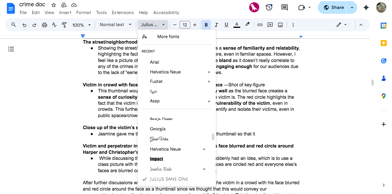
I went on Google Docs and scrolled through the font options to search for fonts that would fit our documentary. Here are some of the best fonts I found.
Where Did Christopher Go? – Impact
When I was scrolling through the font options, this font (Impact) immediately caught my eye. This font is bold and direct, which makes it a great tool to grab the audience’s attention. Additionally, the font is very intense, which paints the theme of stalking and kidnapping well, as tension is created using this font. Despite this, Impact may be too bold of a font to be used on the thumbnail as it would take the attention away from the picture, and that’s not what we want. There may be a detraction in the emotional impact of our thumbnail image as the font may come across as too aggressive.

This font gives off a formal look, this connotes that the documentary is professional. Audiences would be attracted to this font if they are looking for a high-quality, serious documentary. In addition, they may also feel as if the documentary has an important message to convey as they may feel like the documentary will discuss investigative and/or intellectual crimes, due to the professional font used. However, the Cinzel font isn’t really eye-catching and may lessen the intensity of the thumbnail, which goes against our kidnapping and stalking theme, or even crimes in general. I personally also think that this font gives off historical vibes, which doesn’t fit our documentary as it features modern high school students.
Where Did Christopher Go? – Times New Roman
The Times New Roman font is neutral, which gives the audiences a serious tone yet doesn’t distract them from the thumbnail image either. This font is also formal and very readable, creating a sense of professionalism. However, this font is frequently used in many different contexts (not just documentaries), so it may not create any impact to the audience and may just come across as bland. Additionally, it doesn’t implement any sense of fear or anxiety into the audience, which takes away the purpose of our thumbnail.

I personally find this font really unique and decorative as I don’t see this font being used often. Due to the font’s uniqueness (as it looks different from everyday fonts), the curiosity within the readers could be evoked due to the sense of unfamiliarity. This font gives off mysterious vibes to the audience, which may make them question the hidden truths and unresolved issues, increasing audience engagement. This font is also eye-catching and isn’t bland, yet still clean and readable, increasing the chances of audiences being intrigued by the title yet also not having their attentions completely distracted by it so that they can still feel the emotional impact from the thumbnail image.
After some discussions with my teammates, we decided to use Julius Sans One as the font for our thumbnail typography. This is because we want to catch the reader's attention and differentiate our crime documentary from others, but not too much (which is why i chose a clean and readable font) that it takes their attention away from the thumbnail image, following the genre theory cultivated by Steve Neale, which states that a media product must be different enough to stand out from other products, yet similar enough to fit into a category.
Reflection:
This blogpost was very useful for our project as again, its purpose was to help us develop our documentary thumbnail. Although Rachelle did almost the entirety of the blogpost, I participated in discussions regarding the development of the thumbnail as well as developed some of the ideas for the thumbnail concepts. I had fun coming up with potential concepts for the thumbnail because we had to have as many creative inputs as possible. By further analyzing the connotations helped make pathways onto which direction the thumbnail should branch into. For example, initially the eye idea for the thumbnail was just supposed to be purely of the victim's eyes showing fear. However, after further pondering, I thought that since wide eyes connoted to fear, we could also add an extra detail of the criminal being reflected as that would further justify the reason for fear being present in the victim's eyes. Initially, Rachelle was supposed to do the entire blogpost but I opted to assist with a few of the development due to time constrictions so I just wanted to help in any way that I could. I did almost have a little argument with Rachelle because of the division of task though but thankfully, it didn't escalate due to us properly communicating with one another.